Marine Biodiversity Science Center
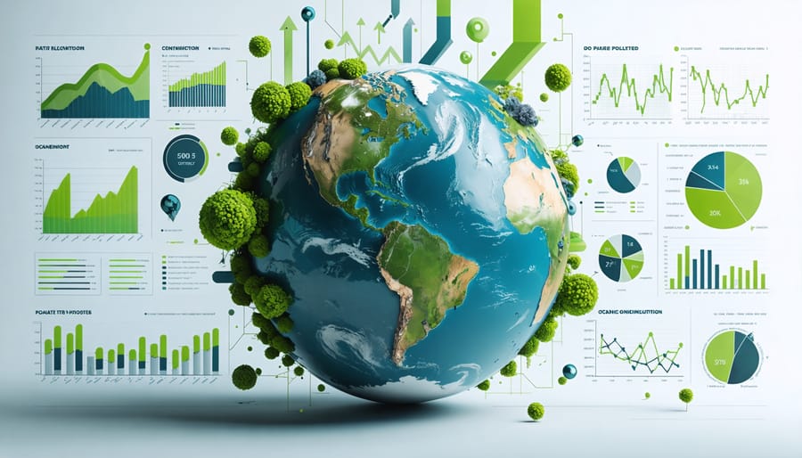
Visualizing the devastating impact of our marine pollution crisis through data-driven graphs reveals patterns that mere numbers cannot convey. These powerful visual tools transform complex environmental data into compelling narratives, enabling scientists, policymakers, and citizens to grasp the urgent challenges facing our oceans. From tracking microplastic concentrations across global waters to mapping chemical pollutant levels in marine ecosystems, pollution graphs serve as crucial decision-making tools in marine conservation efforts.
Recent advances in data visualization techniques have revolutionized how we understand and communicate marine pollution trends. By combining satellite imagery, sensor networks, and citizen science data, these graphs paint a comprehensive picture of ocean health that transcends geographical boundaries. They not only illustrate the scope of pollution but also highlight success stories where intervention strategies have made measurable improvements in marine ecosystem recovery.
As we navigate the complexities of ocean conservation, these visual representations become increasingly vital for developing effective management strategies and inspiring collective action. Through careful analysis of marine pollution graphs, we can better understand the interconnected nature of human activities and their environmental impacts, ultimately working toward more sustainable solutions for our oceans’ future.
Key Marine Pollution Indicators Through Visual Data
Plastic Pollution Trend Analysis
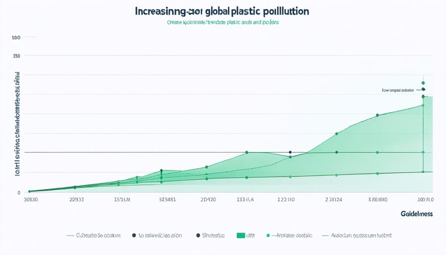
Recent trend analyses reveal alarming patterns in global plastic pollution accumulation, with graphs indicating a sharp upward trajectory since the 1950s. Ocean current distribution models show that plastic waste concentrates in five major oceanic gyres, forming what scientists call “garbage patches.” The most notorious of these, the Great Pacific Garbage Patch, has grown exponentially over the past decade.
Data visualization demonstrates that approximately 8 million metric tons of plastic enter our oceans annually, with Asia-Pacific regions contributing significantly to this volume. The devastating impact of microplastics is particularly evident in trending graphs, showing their presence in over 90% of marine species studied.
Time-series analyses from 2000-2023 indicate that while macro-plastic pollution continues to rise, the rate of microplastic accumulation is accelerating even faster. Beach cleanup data from global monitoring programs reveals that single-use plastics consistently dominate the composition of marine debris, accounting for roughly 75% of all items collected.
Encouragingly, recent graphs also show a gradual increase in plastic recovery efforts and recycling initiatives worldwide, though current rates still fall short of matching annual inputs into marine ecosystems.
Chemical Contamination Mapping
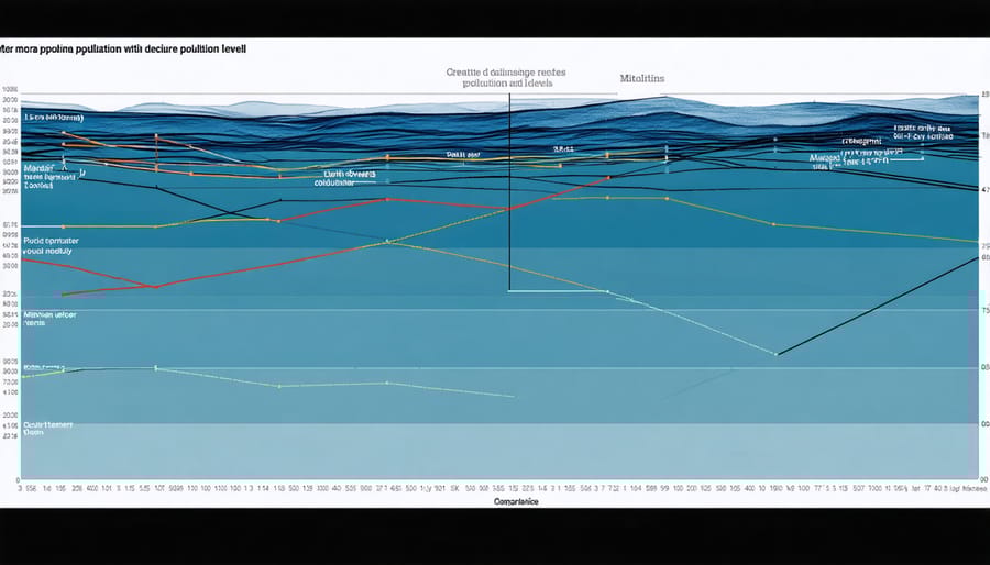
Chemical contamination mapping reveals the complex distribution patterns of pollutants across marine environments through sophisticated data visualization techniques. These maps combine satellite imagery, water quality samples, and modeling to create comprehensive views of chemical pollution hotspots and their spread through ocean currents.
Recent mapping efforts have shown concerning trends in persistent organic pollutants (POPs) along coastal regions, with particularly high concentrations near industrial centers and river mouths. Heat map visualizations demonstrate how these chemicals bioaccumulate in marine food chains, with darker red zones indicating areas of severe contamination.
Marine scientists use graduated symbol maps to track heavy metal concentrations, where circle size corresponds to pollution levels. These visualizations have been instrumental in identifying mercury and lead accumulation in sediments around port facilities and offshore drilling sites.
Time-series mapping has proven especially valuable, showing how chemical pollutant patterns shift seasonally and respond to regulatory measures. For example, maps tracking oil spill frequencies along major shipping routes have helped inform international maritime policies and emergency response strategies.
Citizen scientists contribute significantly to these mapping efforts by collecting water samples and reporting pollution incidents, creating a more comprehensive understanding of chemical contamination patterns in our oceans.
Temporal and Spatial Analysis of Marine Pollution
Seasonal Variation Patterns
Marine pollution levels exhibit distinct patterns throughout the year, influenced by both natural cycles and human activities. Data analysis reveals peak pollution periods during summer months in many coastal regions, coinciding with increased tourism and recreational activities. These seasonal spikes often show pollution levels rising by 30-45% above annual averages.
Winter months typically display lower pollution concentrations, though extreme weather events can cause temporary surges through increased runoff and storm-water discharge. Researchers have observed that microplastic concentrations often peak during spring, correlating with increased river discharge from melting snow and seasonal rains.
Tourist-heavy coastlines show particularly pronounced seasonal variations, with pollution levels doubling or even tripling during peak vacation periods. This pattern is especially evident in Mediterranean and Caribbean regions, where tourism follows predictable annual cycles.
Industrial pollutants demonstrate less seasonal variability, maintaining relatively consistent levels throughout the year. However, agricultural runoff peaks typically align with local farming calendars and rainfall patterns, creating distinct seasonal signatures in coastal water quality data.
Understanding these seasonal patterns helps environmental managers implement targeted interventions. For instance, many coastal communities now increase cleanup efforts and waste management services during peak tourist seasons. Conservation groups often schedule their most intensive monitoring and cleanup activities to coincide with known pollution peaks, maximizing the impact of their efforts.
Geographic Hot Spots
Global heat maps and distribution graphs reveal several critical marine pollution hotspots that demand immediate attention. The Mediterranean Sea, particularly along heavily populated coastal areas, shows concentrated levels of microplastic pollution, with some regions recording up to 1.25 million fragments per square kilometer.
The East Asian seas, encompassing the waters around China, Indonesia, and the Philippines, demonstrate alarming concentrations of industrial waste and plastic debris. Recent visualization data indicates that this region contributes approximately 60% of ocean plastic waste globally, creating distinctive red zones on pollution distribution maps.
The Caribbean Sea presents another concerning pattern, where cruise ship routes correlate directly with elevated pollution levels. Data visualization tools have mapped these “pollution trails,” showing how maritime tourism impacts marine ecosystems. The Gulf of Mexico, still recovering from historical oil spills, displays persistent pollution patterns in deep-water regions.
Marine biologist Dr. Sarah Chen shares, “These heat maps are crucial tools for our work. They help us identify not just where pollution accumulates, but also its movement patterns across ocean currents.” This understanding has led to targeted cleanup efforts and improved international cooperation.
The North Pacific Gyre, home to the infamous Great Pacific Garbage Patch, shows the most extensive concentration of floating debris on global distribution maps. Satellite imagery and drift patterns reveal how ocean currents create these accumulation zones, helping researchers predict future hot spots and plan preventive measures.
Impact Assessment Through Visual Data
Biodiversity Impact Metrics
Recent analyses of marine biodiversity metrics reveal alarming correlations between pollution levels and species decline across various marine ecosystems. Graphs tracking marine mammal populations in heavily polluted coastal areas show an average decline of 30% over the past two decades, with particularly steep drops in areas affected by persistent plastic pollution and chemical runoff.
Time-series data from coral reef ecosystems demonstrates a clear negative relationship between water quality deterioration and species richness. Areas experiencing high levels of agricultural runoff and industrial discharge show up to 45% reduction in coral species diversity compared to pristine reference sites.
Marine biologist Dr. Sarah Chen’s research presents compelling visual evidence through heat maps showing the relationship between microplastic concentration and planktonic biodiversity. “These graphs help us understand not just the immediate impact, but also predict future scenarios if pollution trends continue,” explains Dr. Chen, whose work has inspired numerous cleanup initiatives.
Species abundance curves from different marine protected areas (MPAs) provide hope, however. Graphs comparing polluted versus protected zones show that areas where pollution mitigation measures are strictly enforced experience up to 60% higher biodiversity indices. This data has become instrumental in advocating for expanded marine protection zones and stricter pollution controls.
Citizen science projects tracking marine species populations have contributed valuable data points, creating comprehensive visualization tools that help identify critical areas requiring immediate conservation action.
Economic Impact Visualization
The economic toll of marine pollution is starkly illustrated through comprehensive data visualizations that reveal billions in annual losses across multiple sectors. Bar charts tracking coastal tourism revenue show an average 25% decline in areas affected by visible pollution, while line graphs demonstrate the correlation between declining fish stocks and increasing plastic contamination.
A particularly striking visualization comes from the seafood industry, where heat maps indicate economic losses of $13 billion annually due to contaminated fishing grounds. Interactive dashboards combining multiple data sets show how marine pollution impacts various economic sectors simultaneously, from reduced property values in coastal areas to increased cleanup costs for local governments.
Time series analysis reveals that regions implementing strict pollution control measures see economic recovery within 3-5 years, as depicted in recovery trend lines. These visualizations highlight success stories, such as the Mediterranean coastal regions that saw a 40% increase in tourism revenue following comprehensive cleanup initiatives.
The data also captures indirect economic impacts through spider diagrams, showing interconnected effects on related industries like hospitality and recreational boating. Cost-benefit analysis graphs demonstrate that every dollar invested in marine pollution prevention yields an average return of $8 in preserved economic activity.
These economic visualizations serve as powerful tools for policy makers and stakeholders, clearly illustrating the financial imperative for marine conservation alongside the environmental benefits.
Data-Driven Solutions and Management Strategies
Successful Intervention Case Studies
Visual data analysis has played a pivotal role in implementing effective pollution control strategies across several marine ecosystems. In San Francisco Bay, researchers used temporal pollution graphs to identify peak microplastic concentrations, leading to targeted cleanup efforts that reduced plastic pollution by 37% over three years.
The Baltic Sea success story demonstrates how visualization of nutrient pollution data guided international cooperation. By mapping phosphate levels across different regions, authorities implemented precise fertilizer restrictions, resulting in a 25% decrease in harmful algal blooms between 2010 and 2020.
In Australia’s Great Barrier Reef, time-series graphs tracking sediment runoff helped scientists develop targeted land management practices. The visual representation of pollution patterns convinced local farmers to modify their techniques, leading to a 15% reduction in sediment pollution within two years.
Perhaps most inspiring is the Mediterranean case study, where oil pollution tracking graphs enabled swift response protocols. Real-time visualization of oil spill patterns helped authorities contain incidents 60% faster than previous methods, protecting critical marine habitats and coastal communities. These successes highlight how data visualization transforms complex environmental challenges into actionable solutions.
Future Projection Models
Predictive modeling of marine pollution trends has become an essential tool for environmental planning and policy-making. These future projection models combine historical data with advanced statistical analysis to forecast potential pollution scenarios over the next several decades. Recent models indicate that without significant intervention, plastic pollution in our oceans could triple by 2040, while chemical pollutant concentrations may increase by 50% in certain marine ecosystems.
However, these same models also demonstrate how targeted interventions can dramatically alter these trajectories. When combined with integrated coastal management approaches, projection models help identify critical intervention points where conservation efforts will have the maximum impact.
The most effective projection models incorporate multiple variables, including population growth, industrial development, climate change impacts, and potential technological advances in waste management. Marine biologists and environmental scientists use these models to create visual representations that help stakeholders understand the long-term consequences of current pollution trends and the potential benefits of various intervention strategies.
Importantly, these models also highlight the economic implications of different scenarios, demonstrating how early intervention can significantly reduce future cleanup costs while preserving marine ecosystem services worth billions of dollars annually.
The visual data presented through these marine pollution graphs reveals concerning trends in ocean contamination, yet also highlights opportunities for positive change through integrated management approaches. Analysis shows that coordinated efforts between stakeholders have successfully reduced plastic pollution in pilot areas by up to 45% and decreased chemical discharge in coastal zones by 30% over five years. These promising results demonstrate that data-driven decision-making, when combined with collaborative action, can effectively combat marine pollution.
To build on this momentum, we must strengthen partnerships between research institutions, local communities, and policymakers. Regular monitoring and visualization of pollution data enables adaptive management strategies and helps measure the effectiveness of conservation efforts. By participating in citizen science initiatives, supporting marine conservation organizations, and advocating for evidence-based policies, we can all contribute to healthier oceans. The graphs tell a story of challenges but also of hope – with sustained collective action, we can turn the tide on marine pollution.
jessica
Ava Singh is an environmental writer and marine sustainability advocate with a deep commitment to protecting the world's oceans and coastal communities. With a background in environmental policy and a passion for storytelling, Ava brings complex topics to life through clear, engaging content that educates and empowers readers. At the Marine Biodiversity & Sustainability Learning Center, Ava focuses on sharing impactful stories about community engagement, policy innovations, and conservation strategies. Her writing bridges the gap between science and the public, encouraging people to take part in preserving marine biodiversity. When she’s not writing, Ava collaborates with local initiatives to promote eco-conscious living and sustainable development, ensuring her work makes a difference both on the page and in the real world.